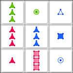
“Traits” Submitted
I submitted my first solo iOS game, “Traits,” to Apple for approval. It’s essentially an updated version of “Tripod,” which I wrote in 2001 as a Java applet: better graphics, sound effects, and more refined gameplay and options. The touch screen really adds a lot to the game. I made sure you can select tiles simultaneously with multiple fingers.
My goal here was to write and submit something, start to finish, in about a week. I’m taking to heart a number of ideas, often expressed as aphorisms: (a) that finishing is more important than starting, (b) that the perfect is the enemy of the good, (c) that premature optimization is the root of all evil. The overarching idea is well expressed by the pottery study described in Art & Fear:
The ceramics teacher announced on opening day that he was dividing the class into two groups. All those on the left side of the studio, he said, would be graded solely on the quantity of work they produced, all those on the right solely on its quality. His procedure was simple: on the final day of class he would bring in his bathroom scales and weigh the work of the “quantity” group: fifty pound of pots rated an “A”, forty pounds a “B”, and so on. Those being graded on “quality”, however, needed to produce only one pot– albeit a perfect one– to get an “A”. Well, came grading time and a curious fact emerged: the works of highest quality were all produced by the group being graded for quantity. It seems that while the “quantity” group was busily churning out piles of work– and learning from their mistakes– the “quality” group had sat theorizing about perfection, and in the end had little more to show for their efforts than grandiose theories and a pile of dead clay.
So my observation was that I should just make lots of apps. Lots of art. And by “make”, I mean “complete”. Finish each project, and put it out there to be “judged”, or “received” if we’re looking for a gentler word.
 “Traits” took me a little longer than I’d planned, since I ended up adding more polish than originally intended, and I hope that shows in the product. For example, I spent a lot of time trying to get the selected/unselected tile graphics right, and tweaking the specific shades of red, green and blue used for the shapes. I’m not colorblind, but I became aware that peripherally, certain shades took a little bit longer to distinguish from each other. For example, I could have used “pure” red, green and blue color values, but pure green is much brighter than blue or red (so this didn’t look balanced); it was also harder to recognize the green shapes, since the edges had less contrast. The pure RGB color values also simply didn’t look as pleasant. However, if I adjusted any of the three colors, that put it closer to one of the other two, making it and the other a tiny bit harder to distinguish. So finally, what worked was what turned out to be roughly a slight hue rotation: you’ll notice that the red used is slightly purplish, but not enough to be called anything other than red; the green is slightly orange-ish (but definitely still green), and the blue is slightly greenish. It seems trivial, but discovering the perfect colors was a bit of a “eureka!” moment. The image here isn’t even an accurate representation of what you see on the iPhone/iPod screen, which seems to have a different color gamut. (E.g., the red looks redder and less pinkish.)
I put together a “marketing/support page” which Apple required, with more screenshots and gameplay notes.
I hope you enjoy playing the game, when it’s approved. If enough people like it, I’ll consider doing an Android port.